AI longevity platform · Case study
Making a practitioner dashboard readable before making it comprehensive.
Expand Health is an AI co-pilot for longevity doctors and health practitioners. It pulls a client's wearables, lab results, lifestyle data, and clinical notes into one place, and uses AI to keep the practitioner ahead of all of it.
- Product
- Expand Health
- Role
- Product designer · sole designer
- Timeline
- Apr to Jul 2025 · ~4 months
- Team
- 8 people
- Tools
- Figma · Framer
- Scope
- Full platform, all modules
The difficult part
A practitioner managing twenty-plus clients cannot re-read a full health history before every session. Wearables alone generate more data in a week than anyone can honestly review. The brief said “bring all the data together.” The real problem was the opposite: decide what the practitioner should look at first.
And there was a trap waiting. Dense, clinically important, time-series data drifts naturally toward looking like a spreadsheet. A spreadsheet is exactly what a practitioner between appointments will not read.
The product story
The dashboard opens with a triage layer: four scores for sleep, diet, stress, and activity. Colour-coded, glanceable, and honest about their job, which is not to diagnose anything but to say “look here first.” Below them, an AI summary rebuilds the client brief on demand: goals, symptoms, history, allergies. Thirty seconds of reading buys a meaningful conversation.
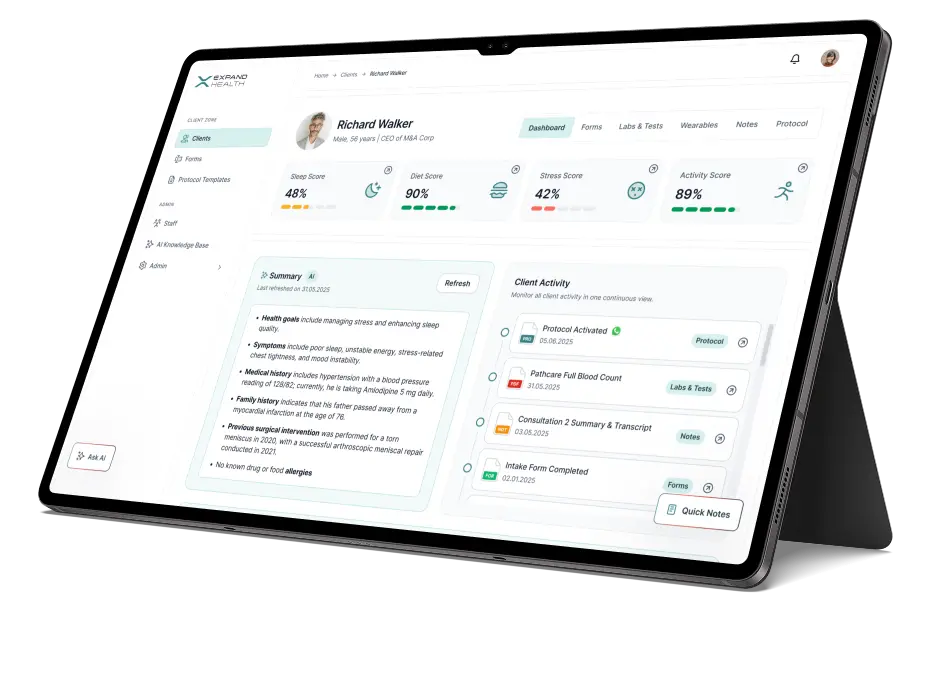
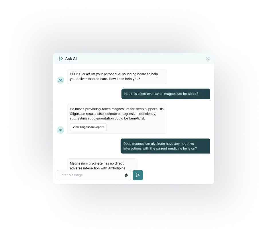
Around that core I designed the full platform: protocols, forms, labs and tests, wearables with dual-axis charting, notes, staff management, and the AI knowledge base. A persistent Ask AI button lets the practitioner ask things like “has this client taken magnesium for sleep?” without leaving their current view.
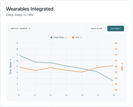
The hardest single design was the biomarker correlation view: comparing markers across a client's history so patterns surface, like HRV dropping every time sleep dips below 50%. Which markers show by default, how to hint at correlation without overclaiming causation, how to stay scannable without losing nuance. Progressive disclosure, again, did the heavy lifting.
Design system and interaction thinking
I built the component library as I went: score cards, chart containers, feed items, and form patterns reusable across all modules. The wearables charts got particular care, with dual-axis comparisons, date-range control, and PDF export, designed to read as clinical evidence rather than fitness-app decoration.
Result
I prototyped the platform end to end in Figma as a clickable prototype, and it did double duty: the client used it to present the product to their team and to investors. That is the quiet superpower of interactive prototypes: they let non-designers see the product before it exists, and they moved stakeholder conversations from “what will it be?” to “when can we have it?”
Mid-project, scope extended to the Southeast Asia launch: I designed and built the regional landing pages in Framer, positioning precision longevity care for the Bangkok 2025 opening. The engagement ended with an appreciation certificate from the design director, which is the kind of outcome that does not fit in a metric but pays for the next project.
What changed in my thinking
Expand Health taught me to design the reading order before the layout. Health data will always outgrow the screen; the score-first triage pattern gave me a reusable answer I later carried into other clinical work. It also settled a personal argument: readable beats comprehensive, every time someone is between appointments.